Moving the conference away from New York is a big deal so we wanted to make sure to acknowledge this year's host city, Chicago, in the conference's identity. At first we thought of some of the obvious things we could derive visual elements from: theCTA and its iconic "L" subway map, or the "Ghost Signs" on brick buildings, or the logo on all of Chicago's album covers, or even (and gasp) the Chicago Cows on Parade. Needless to say, we were coming up short.
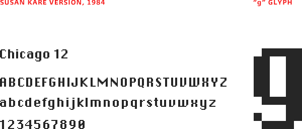
Because we are always obsessing about 1984 — the year, not the dystopian novel — one day our thoughts led us to the origins of the Mac, the venerable tool that allows most of us to make a living. This led to thinking about Susan Kare and her original family of fonts for the deliciously low resolution interface of the original Mac Operating System. Short of a dozen bitmap fonts, all were named after the world's greatest cities: New York, Athens, San Francisco, Monaco, among others. And, yes, Chicago.
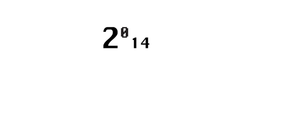
A delightful bitmap font with a heavily accentuated contrast between its thicks and thins, Chicago was the main interface font in Mac's OS and decades later it was also the UI font of the original iPod. However, as the OS evolved and the resolution increased, Apple moved away from bitmap fonts and began introducing smooth-edged fonts in the interface; not ready to leave Chicago behind Apple commissioned Bigelow & Holmes to literally smooth out the original version, keeping the same structure but curving all the corners. The result could be considered one of the least appealing typefaces today and Apple slowly swept it under the rug; first decommissioning it from its UI use and later leaving it out completely of the OS.
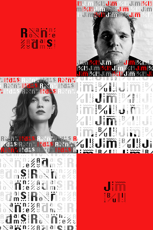
This Dr. Jekyll and Mr. Hyde — or, well, more like Mr. Hyde and Mr. Hyde — double personality and the legacy of Chicago as a font in the Apple brand was very appealing and seemed like a good place to start exploring.
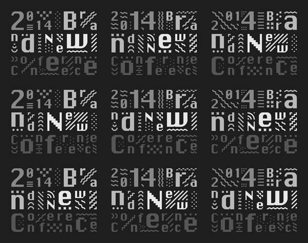
As usual, we are also thinking about trends — both the interesting and the ludicrous. One of the latter is the use of "Wiggles". That's right. Wiggles. They don't serve much of a purpose but they are festive. They also start to look like weather or forecast icons of some kind, particularly wind… hey, Chicago, is windy!
-
So: Chicago bitmap, Chicago smooth, wiggles, patterns, strips of data… this is where we ended up:
-