John Lewis Broadband launched at the end of April, 2012. Almost a year earlier, NB Studio was invited by the brand team at John Lewis to design the visual identity and create a simple toolkit/guidelines that would inform the look of all branded elements – were we interested?
At once we began cramming; reading, researching, checking out competitors and paying a visit to the shop in Oxford Street to ensure we’re up on the retail landscape. Days later we had a mountain of questions, so we took them with us to the briefing.
We learnt a lot at this briefing session, partly because the client is great at giving us what we need, and partly because we went in prepared. Notebooks at the ready, we set out to learn the background to the project, the business objectives, team goals, target audience, project must-haves – anything and everything could be useful at this stage.
John Lewis Broadband is a new service to replace previous broadband offerings from Greenbee and Waitrose. The visual identity we’re creating must fit with the master brand and convey the product attributes. It must stand-out in store and across different departments. It must look suitably different online, sit well with the competitor set and carry John Lewis out of it’s natural habitat and into comparison websites, online ads and consumer magazines.
What we capture informs our own NB brief, which we fill with relevant facts and anecdotal clues gleaned from the client. Now we have this, we can create a full fee proposal informed by our understanding of the project, creative start points, a quick look at the competitor landscape, the project scope, budget and timescale.
With the project confirmed and budget signed-off, we’re ready to go. We meet the wider team at John Lewis, the client sponsor, and the ad agency (see adverts, left) to get their take on the proposition ‘Simply Brilliant Broadband’
By now there’s much anticipation in the studio, so we share. We give our designers a full briefing. I give a speech about simplicity, clarity, restraint, Paul Rand and IBM. No pressure there then. When we can get the whole team involved like this, it creates higher levels of creative energy and a healthy dose of competitiveness – it’s a really effective way of working.
They have one week to think, scribble and get their ideas down on paper, and we meet that Friday afternoon for what is effectively a ‘show and tell’ with beers. From there we chose the best ideas to take forward and invest more time in.
We present three exploratory themes as finished ‘sketches’ and mood boards, making sure to demonstrate a clear link back to the brief.
The team at JL thinks our route one is on the money and latches on to a particular image which sums up what we’re trying to do. Luckily it’s the Munich ’72 Olympics graphic that we think captures the spirit of the project - we’re already big fans.
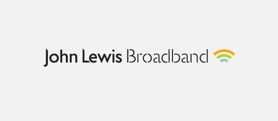
In order that people will know that this product is broadband, we borrow the universal wireless broadband symbol and make it our own through careful use of colour, form and translucency in overlapping animations. We crafted the typography to create something different to the master brand. We commissioned a writer to set the tone and introduce the product. We created simple templates for the website, ads, posters, leaflets, point of sale, product purchase tools and merchandising. And from there we produced a simple toolkit informed and inspired by the product itself and design principles we established.