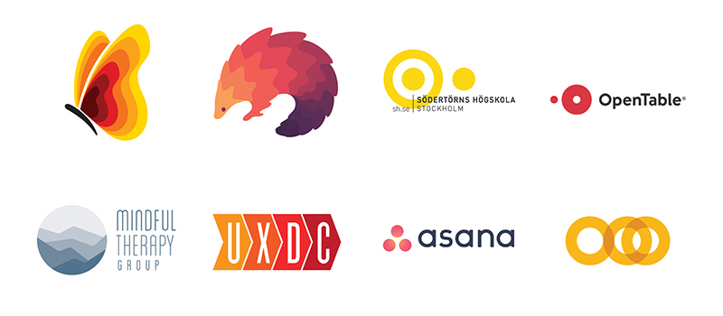
Drawing from a year of observation, and a few all-nighters perusing recent uploads on LogoLounge, an overall thought occurred to me: KISS is making a comeback. Not that KISS. Sorry fans. KISS as in Keep It Simple Stupid. Designers are paying heed to the old saying and rebelling against complexity. Simplicity is king once again.
Typography has taken a decidedly strong swing to the austere. Nearly a neo-Swiss style, many wordmarks have abandoned much of their personality and adopted a universal sans-serif construction. I say neo because with every incarnation of a style there are shifts from its former self.
Notice also the simplicity of shape. Pure geometry is much more evident as foundation components in logos. As well investigate, the circle has never been more central to design and in such a stripped down motif. Center stage without the wardrobe. These pared down planes are popping up across the board. More and more companies are electing to go, or following their designers, down this road. One conclusion we might draw is that a simplistic logo represents a company whose products or services are perhaps uncomplicated and speak for themselves.
