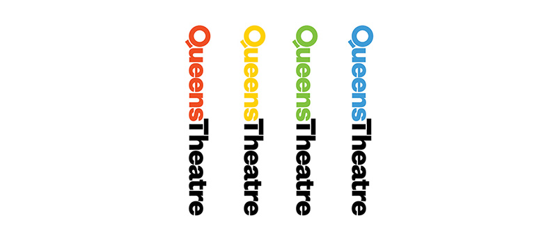
Queens Theatre is the premier performing arts venue in Queens, New York, presenting world-class theater, dance, music and comedy. The innovative productions are matched by a one-of-a-kind location: QT is located in the historic Theaterama, one of the three structures that originally comprised the New York State Pavilion at the 1964 World’s Fair in Flushing Meadows Corona Park. Pentagram’s Paula Scher has designed a new identity for Queens Theatre that conveys its vibrant programming and unique setting. The logo employs simple shapes inspired by the geometric forms of the pavilion, which marks its 50th anniversary this year.
Scher worked closely on the project with Taryn Sacramone, Queens Theatre’s Managing Director. Queens is the most ethnically diverse county in the US, and the Theatre was looking for a visual language that would appeal to an incredibly varied audience and provide a cohesive system for promoting a wide range of activities. At the same time, QT needed an identity that would reflect its position as an important arts institution and help it stand out in New York City’s crowded cultural landscape.
“Our programming is incredibly diverse,” says Sacramone. “I wanted one strong identity that unified all of our materials and communications. We are also working to reach new audiences, and people unfamiliar with Queens Theatre will make an assumption about the artistic quality of our productions from the artistic quality of our branding. I wanted the look of our new identity to match the quality of what we put on stage.”


